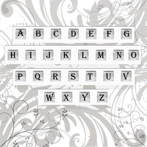
Times New Roman may be your default font, but onscreen its curvy design with tiny tails on the ends of letters, called serifs, may slow word recognition and force you to stare harder and longer, contributing to eye fatigue.
Fonts like Arial and Verdana, which have more space between letters and no serifs, can make words appear crisper and easier to read from farther away, taxing your vision less.
-James Sheedy, PhD,
director of the Vision Performance Institute
Pacific University College of Optometry